When considering external design, the first thing people look at is color. It’s a powerful tool that can create a façade that generates engagement, develops a neighborhood’s identity, or simply causes a structure to blend into its surrounding area perfectly. Depending on hue and tone, specific colors complement while others clash spectacularly. Therefore, it’s imperative that a design choice conveys precisely what it’s meant to and doesn’t offset the exterior of a home or business.
“Color is the most versatile, simple way to affect a design and call attention to an area. Many neighborhoods across the world draw attention from tourists through the creative use of color. In addition, architectural psychologists have found that people are more engaged with complex façades, using a mix of materials (specifically those with natural patterns) and pleasing color palettes.” —Tracy Naugle, Engage’s Architectural Design Manager
With these points in mind, let’s explore the best color combinations to utilize with FastPlank, our high-performing aluminum siding system. Specifically, we’ll focus on the Dark Walnut color option when designing the exterior of a building.

Creating Contrast
Pairing contrasting colors is a sophisticated technique designers use but can be achieved by anyone opting to create an impression of refined elegance. The ability to contrast colors on your façade consists of choosing color schemes with opposing tones on the color wheel.
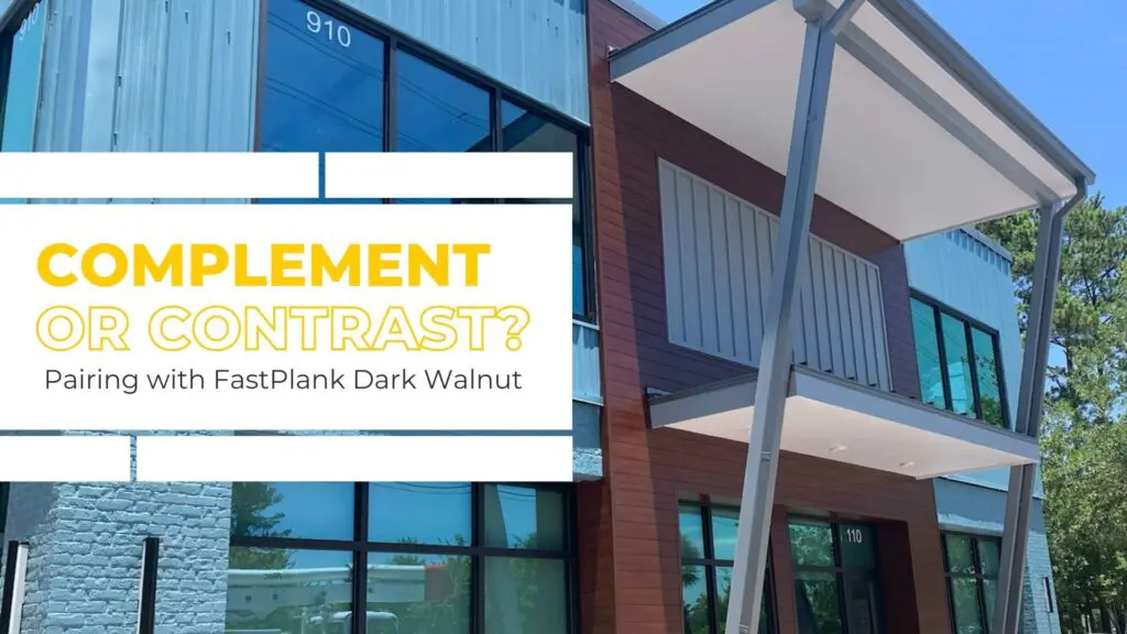
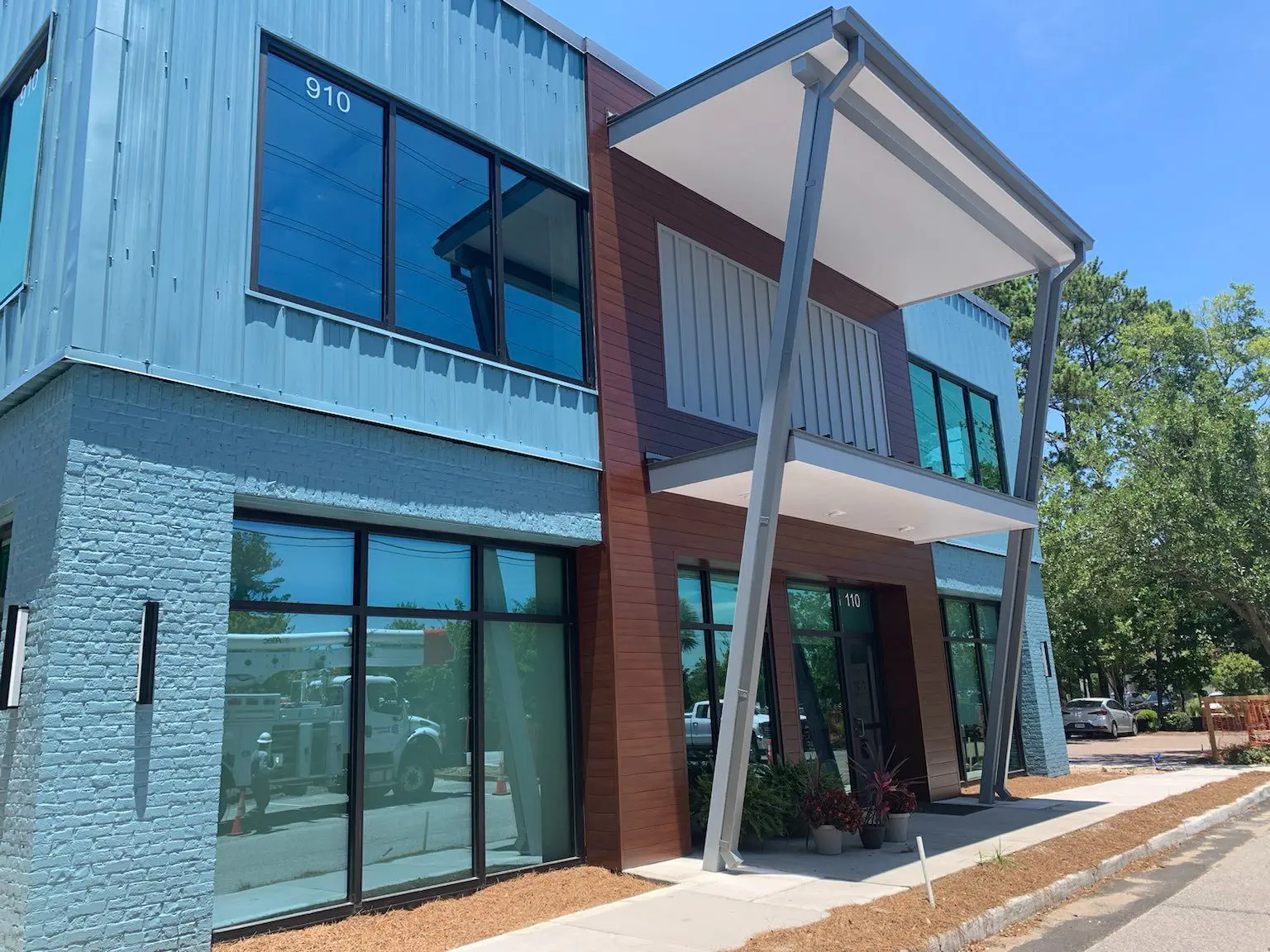
FastPlank Systems Dark Walnut finish is considered a warm to neutral color due to its black and purple-ish undertones. Because of this, deciding to pair this cladding with whites, creams, or light blues and greens can produce a very striking and distinctive look that will draw more attention to the exterior of a building.

Balanced Complementing Colors
If you’re looking to create a more luxurious and classic feel to a structure’s façade, choosing to pair the Dark Walnut pattern option with richer forest greens and navy blues is the direction you should take. Utilizing deep jewel-toned colors gives an exterior a moody, traditional look without appearing muddy and dull.
Combining these two complementing colors will not only bring out the warmth of the woodgrain pattern but will also create a balanced appearance that will add a sense of depth and drama to any building.

If you want to create an alluring exterior that immediately captures the attention of passers-by, consider utilizing the bold FastPlank Dark Walnut finish in your next project. Pairing this design option with a suitable color scheme will help your exterior stand out and express your aesthetic. Make sure you’re getting the most out of your façade by taking time when considering this feature. The result will speak for itself!
Not sure whether you should contrast or complement your exterior? Our knowledgeable representatives are available to assist. Contact us today to receive free samples and a complimentary, no-obligation quote.


